Every business active in the digital world must choose responsive web design as their standard approach since it serves them effectively for online success. Your website implements adaptive design features that deliver optimal viewing quality across every screen dimension while adjusting to different devices automatically. The power of adaptability stands as a vital factor that establishes its direct influence on user interaction and search engine results as well as business achievement.
Mobile-Friendly

Mobile device popularity has made it essential to maintain a mobile-friendly website design. Your website can adjust its layout dimensions according to any screen dimension regardless of smartphone desktop or tablet screen size. Users experience complete ease of browsing since the flexible design avoids the necessity of zooming and horizontal scrolling. The redesign of a prime client’s website for mobile responsiveness produced a 30% traffic boost from mobile devices during a single-month period. The redesign improved user satisfaction at the same time it expanded the client base through new audience access.
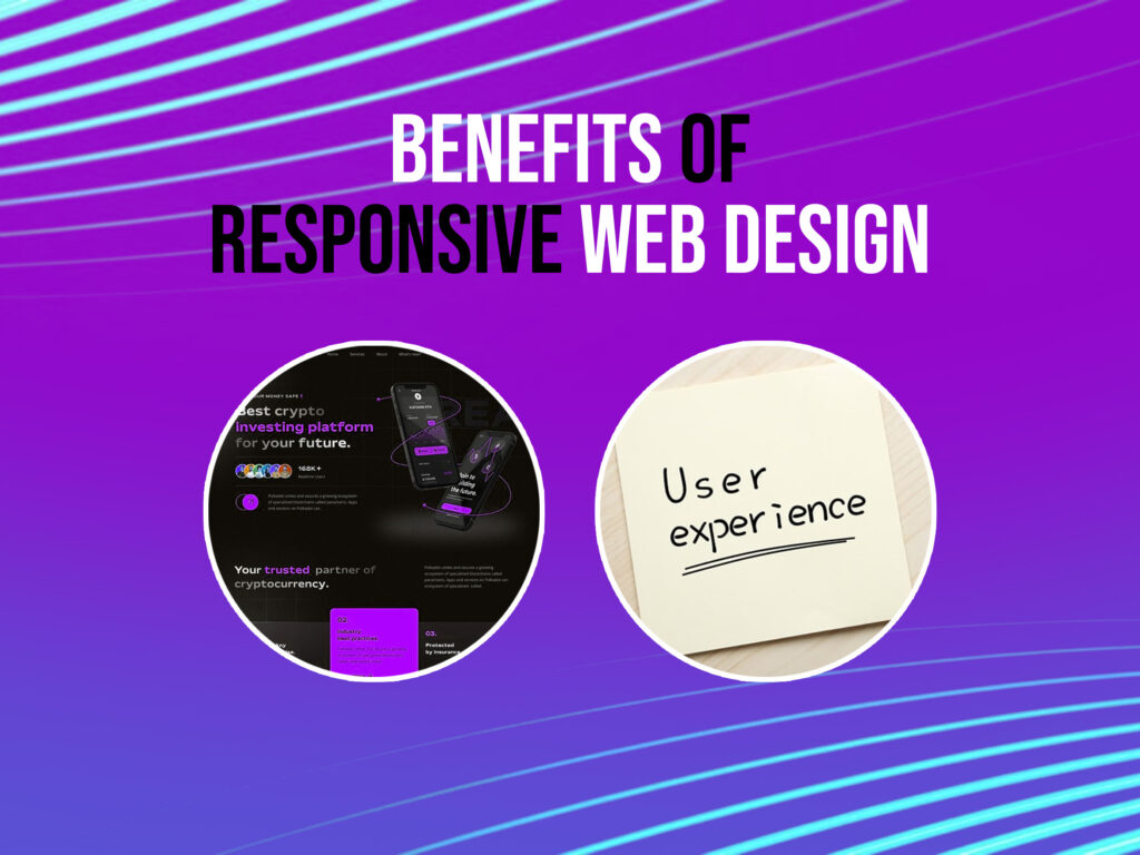
Improved User Experience
Retaining visitors depends heavily on user experience (UX) as it motivates them to move deeper into the site. Your website maintains user-friendly consistency of layout and functions along with image display across all devices through responsive design implementation. A consistent presentation across screens helps users stay longer on your site while lowering the number of people who leave immediately.
Our client notified us about their responsive design update because visitors stayed longer and spent less time leaving the site which showed improved user satisfaction with the site’s convenience.
Flexible Layouts
A responsive web design system employs both changeable grids and dynamic layouts that adjust automatically based on screen size and orientation factors. The flexible layout systems allow for content show that considers both website appearance and feature functioning properly. Flexible layouts allow businesses to keep websites visually appealing while also providing easy navigation depending on the device used. Flexible layouts are my most essential feature for maintaining brand consistency and increasing customer engagement across several platforms.
Content Creation Without Hassle
The management of content becomes complicated when you operate dual websites meant for desktop and mobile users. The process becomes simpler when you develop one website version using responsive design because it works without any issues on every device. Your approach creates content consistency saves time and reduces efforts that would otherwise be needed for updates and maintenance operations.
I recently observed how a former client operated two independent mobile sites and a desktop site while encountering content inconsistencies which in turn raised their overall maintenance requirements. Their content management process improved and their platforms maintained uniformity through their transition to responsive design implementation.
Improved Loading Time

Website loading speed is a very important factor that influences user satisfaction and search engine rankings. Responsive web designs are optimized for fast loading times, ensuring that users can access your content quickly, regardless of their device. Techniques such as optimized images and efficient coding practices contribute to faster page loads.
In my experience, optimizing a website’s design for responsiveness led to a noticeable improvement in loading times, which in turn enhanced user engagement and search engine performance.
Increased Social Media Connectivity
The majority of websites obtain their user traffic through social media platforms. Your site users experience a smooth browsing experience when accessing your site through mobile device social media links because of responsive design principles. The quality of user experience improves sharing behavior which extends your audience reach on social media.
The responsive website allowed us to deliver a favorable user experience to the surge of mobile visitors which resulted in increased audience interaction and content sharing during our social media campaign.
Easy Maintenance
Maintaining separate versions of a website for different devices can be time-consuming and costly. Responsive design eliminates the need for multiple versions, allowing for easier and more efficient maintenance. With a single responsive site, updates and changes need to be made only once, ensuring consistency and reducing the workload.
Enhanced Visibility in Search Engines

Search engines, particularly Google, favor websites that provide a good user experience across all devices. Responsive web design contributes to this by ensuring your site is mobile-friendly, which is a ranking factor in search algorithms. A responsive site also prevents issues like duplicate content, which can negatively impact your SEO efforts.
For instance, after implementing a responsive design for a client’s website, we observed an improvement in their search engine rankings, leading to increased organic traffic.
Have you ever thought about why SEO is important for business?
Reduced Duplicate Content Issues
Having separate desktop and mobile versions of a website can lead to duplicate content, which can affect your search engine rankings. Responsive design removes this issue by providing a single URL for each page, ensuring that all users access the same content. This approach simplifies your SEO strategy and prevents potential penalties linked with duplicate content.
Lower Bounce Rates
A high bounce rate can indicate that users are not finding what they’re looking for or that the website is difficult to navigate. Responsive web design enhances user experience by providing a consistent and user-friendly interface across all devices, which can help reduce bounce rates.
For example, after redesigning a client’s website to be responsive, we noticed a significant decrease in bounce rates, suggesting that users were more engaged and satisfied with their experience.
Faster Pages
The response time of web pages determines visitor retention levels and affects search engine placement. A responsible website design must provide quick page loading across all devices because users want fast access. Page loading speeds improve through image optimization methods together with browser cache employment. The optimization of web pages by responsive design practices has directly resulted in both increased user loyalty and superior search engine ranking outcomes.
Higher Conversion Rates
A seamless and enjoyable user experience across all devices can lead to higher conversion rates, whether your goal is to generate leads, sell products, or encourage sign-ups. Responsive design ensures that users can easily navigate your site and complete desired actions, regardless of the device.
Improved SEO Ranking
Google prioritizes mobile-friendly websites in search results, leading to higher rankings and increased organic traffic.
Easier Analytics Reporting
A single responsive website simplifies tracking user behavior, making it easier to analyze data and optimize for better performance.
Future-Proofing
As new devices emerge, a responsive design ensures your website remains compatible, reducing the need for redesigns.
Read this blog post if you are starting a Shopify business and want to know is Shopify free to use
Conclusion
In today’s digital age, having a responsive web design is no longer optional, it’s a necessity for businesses that want to thrive online. From improving user experience and SEO rankings to boosting conversion rates and ensuring mobile-friendliness, responsive design offers countless benefits.
If you want a seamless, high-performing, and future-proof website, Webronix Solutions is here to help. Our expert team specializes in responsive web design that enhances your brand’s online presence and ensures an optimal user experience, also we provide many services like development, social media marketing, SEO, logo designing services, and more at affordable prices. Contact Webronix Solutions today to take your website to the next level!